Message From Our President
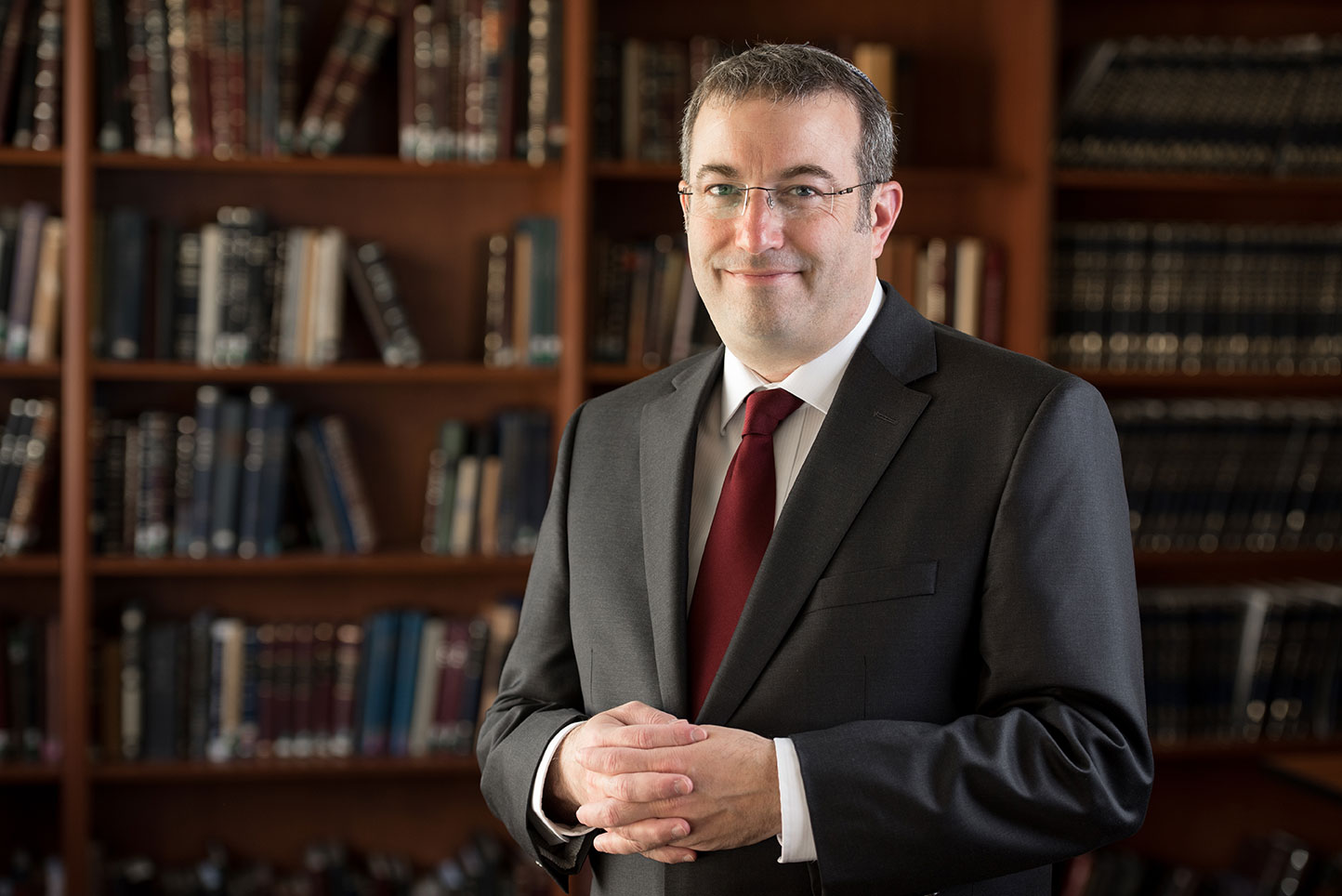
Dear Students, Faculty, Staff and Friends,
I am pleased to present to you this Guide to our plans for the upcoming fall semester and reopening of our campuses. In form and in content, this coming semester will be like no other. We will live differently, work differently and learn differently. But in its very difference rests its enormous power.
The mission of Yeshiva University is to enrich the moral, intellectual and spiritual development of each of our students, empowering them with the knowledge and abilities to become people of impact and leaders of tomorrow. Next year’s studies will be especially instrumental in shaping the course of our students’ lives. Character is formed and developed in times of deep adversity. This is the kind of teachable moment that Yeshiva University was made for. As such, we have developed an educational plan for next year that features a high-quality student experience and prioritizes personal growth during this Coronavirus era. Our students will be able to work through the difficulties, issues and opportunities posed by our COVID-19 era with our stellar rabbis and faculty, as well as their close friends and peers at Yeshiva.
To develop our plans for the fall, we have convened a Scenario Planning Task Force made up of representatives across the major areas of our campus. Their planning has been guided by the latest medical information, government directives, direct input from our rabbis, faculty and students, and best practices from industry and university leaders across the country. I am deeply thankful to our task force members and all who supported them for their tireless work in addressing the myriad details involved in bringing students back to campus and restarting our educational enterprise.
In concert with the recommendations from our task force, I am announcing today that our fall semester will reflect a hybrid model. It will allow many students to return in a careful way by incorporating online and virtual learning with on-campus classroom instruction. It also enables students who prefer to not be on campus to have a rich student experience by continuing their studies online and benefitting from a full range of online student services and extracurricular programs.
In bringing our students back to campus, safety is our first priority. Many aspects of campus life will change for this coming semester. Gatherings will be limited, larger courses will move completely online. Throughout campus everyone will need to adhere to our medical guidelines, including social distancing, wearing facemasks, and our testing and contact tracing policies. Due to our focus on minimizing risk, our undergraduate students will begin the first few weeks of the fall semester online and move onto the campus after the Jewish holidays. This schedule will limit the amount of back and forth travel for our students by concentrating the on-campus component of the fall semester to one consecutive segment.
Throughout our planning, we have used the analogy of a dimmer switch. Reopening our campuses will not be a simple binary, like an on/off light switch, but more like a dimmer in which we have the flexibility to scale backwards and forwards to properly respond as the health situation evolves. It is very possible that some plans could change, depending upon the progression of the virus and/or applicable state and local government guidance.
Before our semester begins, we will provide more updates reflecting our most current guidance. Please check our website, yu.edu/fall2020 for regular updates. We understand that even after reading through this guide, you might have many additional questions, so we will be posting an extensive FAQ section online as well. Additionally, we will also be holding community calls for faculty, students, staff and parents over the next couple of months.
Planning for the future during this moment has certainly been humbling. This Coronavirus has reminded us time and time again of the lessons from our Jewish tradition that we are not in full control of our circumstances. But our tradition also teaches us that we are in control of our response to our circumstances. Next semester will present significant challenges and changes. There will be some compromises and minor inconveniences--not every issue has a perfect solution. But faith and fortitude, mutual cooperation and resilience are essential life lessons that are accentuated during this period. And if we all commit to respond with graciousness, kindness, and love, we can transform new campus realities into profound life lessons for our future.
Deeply rooted in our Jewish values and forward focused in preparing for the careers and competencies of the future, we journey together with you, our Yeshiva University community, through these uncharted waters. Next year will be a formative year in the lives of our students, and together we will rise to the moment so that our students will emerge stronger and better prepared to be leaders of the world of tomorrow.
Best Wishes,
Ari Berman